Great Ideas Screens
Great Ideas Screens
Great Ideas Screens
In collaboration with The Design Museum of Chicago's traveling exhibition Great Ideas of Humanity, the senior UX Professional Practicum class sought to design a digital companion that provided additional information about the posters on display.
In collaboration with The Design Museum of Chicago's traveling exhibition Great Ideas of Humanity, the senior UX Professional Practicum class sought to design a digital companion that provided additional information about the posters on display.
"Trader Joe’s Story: A Legacy in Motion" is an interactive storytelling installation designed for the Trader Joe’s Pop-Up Shop that explores the history of the brand. This project combines the physical with the digital to create a unique viewing experience.
Timeline: September - November 2025
"Trader Joe’s Story: A Legacy in Motion" is an interactive storytelling installation designed for the Trader Joe’s Pop-Up Shop that explores the history of the brand. This project combines the physical with the digital to create a unique viewing experience.


Design Brief
Design Brief
In collaboration with Professor Benjamin Benus and the Design Museum of Chicago, the senior class of UX designers was tasked with designing a companion app for Great Ideas Exhibit.
Featuring over 50 designer created posters inspired by famous quotes, the amount of additional information behind the posters was limited by the amount of space available. The presence of such a culturally rich exhibition at Loyola University New Orleans presented our class with the special opportunity to add to the overall experience of the exhibition.
Visitors needed a way to engage more deeply with the works beyond the physical display. Our team was tasked with designing a mobile app accessible via QR codes at the exhibit, providing an interactive companion experience.
Our goal was to design an intuitive, visually cohesive experience that extends the exhibition’s impact and bridges the gap between physical and digital engagement.
Role
Role
UX Researcher
UI Designer
Library Keeper
UX Researcher
UI Designer
Library Keeper

From conception to prototyping in 10 weeks
From conception to prototyping in 10 weeks
Week 1-2:
Thematic Analysis
This gap between interest and accessibility became the central design problem. The exhibition needed a way to extend its impact beyond what could fit on the gallery wall. Our thematic insight emerged clearly:
Visitors wanted a narrative—an interactive layer that allowed them to explore, learn, and connect more meaningfully with each poster.


Iterations
These iterations experimented with a clean, poster heavy layout. I felt that it matched the aestethics of the exhibition while also placing emphasis on the image. I experimented with a skeuomorphism effect that covered the poster for added interest.
Iterations
These iterations experimented with a clean, poster heavy layout. I felt that it matched the aestethics of the exhibition while also placing emphasis on the image. I experimented with a skeuomorphism effect that covered the poster for added interest.
Iterations
These iterations experimented with a clean, poster heavy layout. I felt that it matched the aestethics of the exhibition while also placing emphasis on the image. I experimented with a skeuomorphism effect that covered the poster for added interest.


Week 3:
User Testing
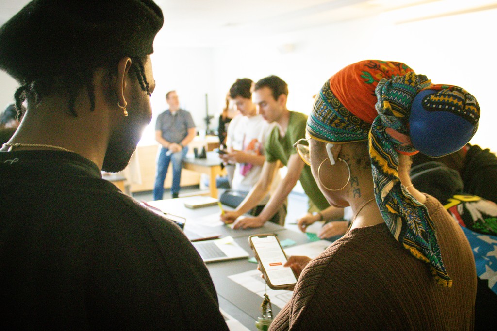
As a team, we conducted user testing with the senior Graphic Designers Each members individual iterations were evaluated for aspects like hierarchy, alignment, clarity, and overall aesthetics.
Week 3:
User Testing
As a team, we conducted user testing with the senior Graphic Designers Each members individual iterations were evaluated for aspects like hierarchy, alignment, clarity, and overall aesthetics.
Week 3:
User Testing
As a team, we conducted user testing with the senior Graphic Designers Each members individual iterations were evaluated for aspects like hierarchy, alignment, clarity, and overall aesthetics.

Feedback on All Screens
The user testing revealed strong appreciation for the overall visual presentation, especially the clarity of the layout, hierarchy, and the modern design language. Testers consistently praised the carousel interactions, bold quote displays, and the ability to enlarge posters. Many users also liked the cohesive branding elements—such as the Great Ideas logo placement, background design, and accessible audio features—which supported engagement and created a polished, design-forward experience.
However, the feedback also revealed recurring usability issues that limited the overall effectiveness of the prototype. Users struggled with non-functioning buttons, unclear hierarchy between designer and quote information, inconsistent alignment, oversized buttons, and difficulty reading text on busy backgrounds. Many commented on confusion about whether elements were clickable, frustration at the inability to zoom into posters, and a general need for clearer navigation cues such as “swipe up” indicators. These insights highlighted the need to refine clarity, hierarchy, interactivity, and legibility across the app.

Week 4-6:
Iterations
Based on the feedback, I made changes to my screens that include:
A more clear hierarchy of information
language of the buttons
further refinement of text layout
Week 4-6:
Iterations
Based on the feedback, I made changes to my screens that include:
A more clear hierarchy of information
language of the buttons
further refinement of text layout
Week 4-6:
Iterations
Based on the feedback, I made changes to my screens that include:
A more clear hierarchy of information
language of the buttons
further refinement of text layout


Week 4-6:
Refinement
After getting the initial feedback from the senior graphic design students and whittling it down to three screens, our class prepared to meet with the client, Professor Benjamin Benus.
Although his critiques were particular and extensive, it overall included simplifying the layout by to keep away from visual clutter, that the navigation should include arrows for poster images and a "Borrow the Book" button linking to a library database, with clear UX language, while also maintaining consistency throughout the layout, links, logos.
Ultimately, that we needed to emphasize the Loyola-Chicago Museum collaboration, as well as making the quotes the focus. After the careful comments and review, we landed on the conclusion to standardize one final screen in moving forward, and focus on simplifying the design with emphasis on making the quotes more prominent and maintaining consistency with the Great Ideas brand within the design.

Week 7-10:
Collaboration and Workflow
Here is our joint Figma file showcasing the workflow. Using variants, we were able to simplify the workload by making one parent screen that allows us to switch the variants out for each poster. We split the work into seperate sections, with me focusing on the library.
Week 7-10:
Collaboration and Workflow
Here is our joint Figma file showcasing the workflow. Using variants, we were able to simplify the workload by making one parent screen that allows us to switch the variants out for each poster. We split the work into seperate sections, with me focusing on
the library.

Library Manager
Key Contributions & Value:
Standardized Core Components: I defined and built essential elements, including Standard Buttons, a comprehensive suite of Text Styles, and reusable general UI Components (like navigation elements and layout grids).
Value: This standardization drastically sped up the design process, allowing the team to assemble screens rapidly without worrying about alignment or styling variations. It ensures a consistent, professional brand experience for the user.
Poster Components: Crucially, I created specialized Poster Components. These dynamic components allowed every unique Great Ideas poster (including the artwork, quote, and designer details) to be plugged into a standardized frame.
Value: This centralized approach made the content (the posters themselves) easy to update and display consistently across different layouts and devices. It prevents errors and ensures the core assets are always presented with correct branding and visual hierarchy.


Final Screens
Final Screens
Key Feature 1:
Full Screen Quote
Large thumbnail of the quote allow the viewer to see the full quote, as many posters do not display it fully. This gives them a reason to scroll further throughout the screen for more info.
Key Feature 1:
Full Screen Quote
Large thumbnail of the quote allow the viewer to see the full quote, as many posters do not display it fully. This gives them a reason to scroll further throughout the screen for more info.
Key Feature 1:
Full Screen Quote
Large thumbnail of the quote allow the viewer to see the full quote, as many posters do not display it fully. This gives them a reason to scroll further throughout the screen for more info.


Key Feature 2:
Access to Monroe Library
A button appears that allows the user to locate the book in the Monroe Library's collection. This seamlessly links the digital artwork to the physical academic resource, encouraging further research
Key Feature 2:
Access to Monroe Library
A button appears that allows the user to locate the book in the Monroe Library's collection. This seamlessly links the digital artwork to the physical academic resource, encouraging further research
Key Feature 2:
Access to Monroe Library
A button appears that allows the user to locate the book in the Monroe Library's collection. This seamlessly links the digital artwork to the physical academic resource, encouraging further research
Key Feature 3:
Direct Link to Designer's Portfolio
Another button offers the opportunity to "View Portfolio," placing the credit directly in the context of their inspiration.
Key Feature 3:
Direct Link to Designer's Portfolio
Another button offers the opportunity to "View Portfolio," placing the credit directly in the context of their inspiration.
Key Feature 3:
Direct Link to Designer's Portfolio
Another button offers the opportunity to "View Portfolio," placing the credit directly in the context of their inspiration.

Final Prototype
The Impact
The Impact
Lasting impression
Our screens encourage taking the ideas each poster presents outside the exhibition. Whether visitors want to simply reread the quotes or go a step further and check out the authors’ books, they are able to reflect on the concepts introduced in the exhibition at their leisure.
Lasting impression
Our screens encourage taking the ideas each poster presents outside the exhibition. Whether visitors want to simply reread the quotes or go a step further and check out the authors’ books, they are able to reflect on the concepts introduced in the exhibition at their leisure.
Scalable
Our template and its content are easy to change due to our flexible component system, allowing its scope to be broadened for future endeavours. An interactive gallery or digital museum wouldn’t be out of the question, for example.
Scalable
Our template and its content are easy to change due to our flexible component system, allowing its scope to be broadened for future endeavours. An interactive gallery or digital museum wouldn’t be out of the question, for example.
Credibility
We’re highlighting a lot of designers and the thought processes that went into their work. At a time when AI art is rampant, we are giving their designs credibility by emphasizing the effort that went into them.
Credibility
We’re highlighting a lot of designers and the thought processes that went into their work. At a time when AI art is rampant, we are giving their designs credibility by emphasizing the effort that went into them.


Photos credited to Shae Schouest
Hungry for more? Check out my other work!
Hungry for more? Check out my other work!
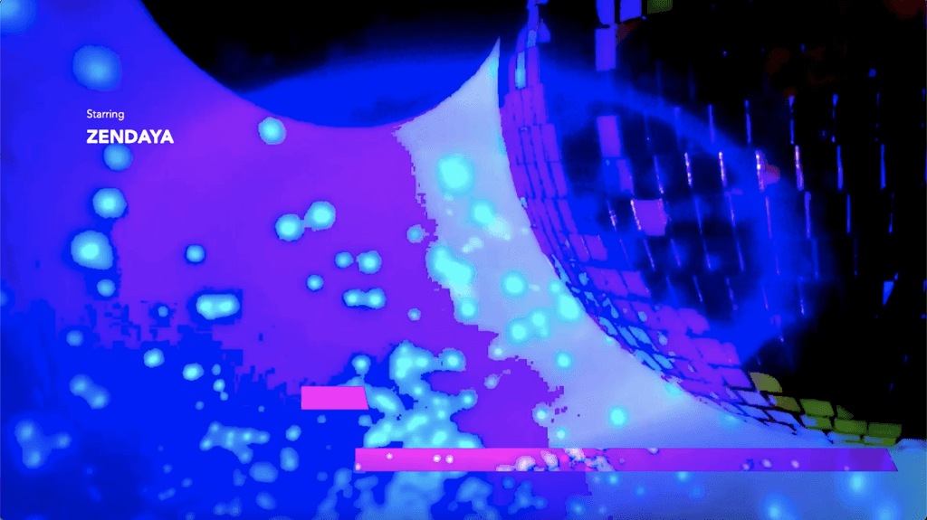
Euphoria Opening Sequence
Opening Title Design
A homework help mobile app that allows you to connect with fellow peers and find course
specific resources.
Niche Website Design
UX/UI Design
Web design for the Loyola design department Niche, where students and alumni sell one of a kind design products.
Niche Website Design
UX/UI Design
Web design for the Loyola design department Niche, where students and alumni sell one of a kind design products.
Niche Website Design
UX/UI Design
Web design for the Loyola design department Niche, where students and alumni sell one of a kind design products.
Euphoria Opening Sequence
Opening Title Design
A homework help mobile app that allows you to connect with fellow peers and find course
specific resources.