Academic Weapon
Tasked with designing an app that would help Loyola University New Orleans students, my group and I decided to focus on designing a homework resource app specifically with Loyola courses that utilized the aid of fellow peers and classmates. We included a chat feature, upload feature,
and customizable schedule.
Tasked with designing an app that would help Loyola University New Orleans students, my group and I decided to focus on designing a homework resource app specifically with Loyola courses that utilized the aid of fellow peers and classmates. We included a chat feature, upload feature, and customizable schedule.
Loyola University students often juggle heavy course loads, multiple responsibilities, and the challenge of staying academically organized with a uniquely close knit campus culture. There was a clear opportunity to design a resource that not only supported students in managing coursework, but also leveraged peer-to-peer collaboration as a strength. Our team identified a gap in tools that combined academic support with real time communication and class-specific content. By creating Academic Weapon, we set out to build an app that empowers students to connect, share resources, and stay on top of assignments through features like class-based chats, file uploads, and course specific study groups all within a platform tailored to Loyola’s academic environment.
Loyola University students often juggle heavy course loads, multiple responsibilities, and the challenge of staying academically organized with a uniquely close knit campus culture. There was a clear opportunity to design a resource that not only supported students in managing coursework, but also leveraged peer-to-peer collaboration as a strength. Our team identified a gap in tools that combined academic support with real time communication and class-specific content. By creating Academic Weapon, we set out to build an app that empowers students to connect, share resources, and stay on top of assignments through features like class-based chats, file uploads, and course specific study groups all within a platform tailored to Loyola’s academic environment.
The Challenge:
The Challenge:
What should a study app specifically targeted at Loyola students provide?
What should a study app specifically targeted at Loyola students provide?
Focusing on the Goals
Focusing on the Goals
In initial concept of my project, three major goals were kept in mind:
Create an app that could help all majors at Loyola, not just limited to design students.
Make it a collaborative environment: We wanted students to be able to share files with each other, chat with professors, and directly communicate with people in their class
Allow it to be personalized: We wanted students to be able to upload their schedule and get relevant resources
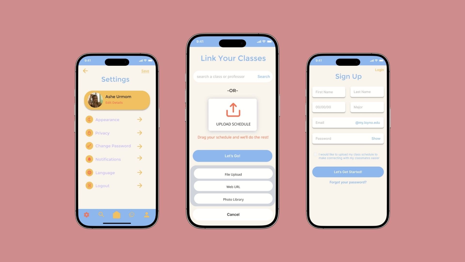
It was essential to create a centralized digital platform that enhances the academic experience for students by streamlining access to coursework, communication, and collaboration. This app was developed to address common pain points students face when managing their classes across multiple platforms. Our solution brings all course-related needs into one intuitive interface.
In initial concept of my project, three major goals were kept in mind:
Create an app that could help all majors at Loyola, not just limited to design students.
Make it a collaborative environment: We wanted students to be able to share files with each other, chat with professors, and directly communicate with people in their class
Allow it to be personalized: We wanted students to be able to upload their schedule and get relevant resources
It was essential to create a centralized digital platform that enhances the academic experience for students by streamlining access to coursework, communication, and collaboration. This app was developed to address common pain points students face when managing their classes across multiple platforms. Our solution brings all course-related needs into one intuitive interface.

Key Features
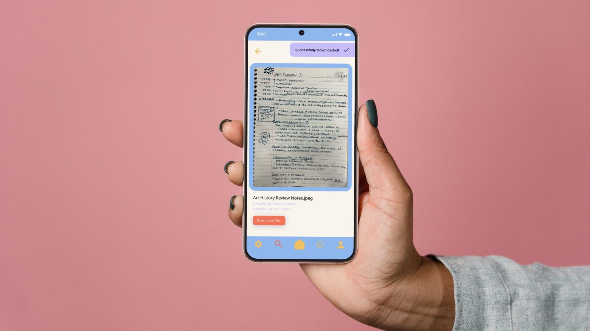
Course Hub: Each course has a dedicated page where students can find syllabi, important documents, and assignment deadlines.
Peer Collaboration: Students can join class-specific group chats to discuss assignments, ask questions, and form study groups.
Direct Communication: Built-in messaging tools allow for easy contact with professors and teaching assistants.
Document Access & Submission: Students can view all shared resources and upload assignments directly through the app.
Key Features
Course Hub: Each course has a dedicated page where students can find syllabi, important documents, and assignment deadlines.
Peer Collaboration: Students can join class-specific group chats to discuss assignments, ask questions, and form study groups.
Direct Communication: Built-in messaging tools allow for easy contact with professors and teaching assistants.
Document Access & Submission: Students can view all shared resources and upload assignments directly through the app.
The Tools:
The Tools:


Who would use this app?
Who would use this app?
Through one-on-one interviews with Loyola students, we identified several recurring challenges and unmet needs related to managing coursework and academic communication. These insights were organized using an affinity mapping process, revealing four core problem areas.
Through one-on-one interviews with Loyola students, we identified several recurring challenges and unmet needs related to managing coursework and academic communication. These insights were organized using an affinity mapping process, revealing four core problem areas.

User interviews revealed that students struggle with limited professor communication, scattered online resources, and a lack of academic community, especially in non-major classes. Many feel isolated, procrastinate when resources are hard to find, and prefer asking peers for help. These insights highlighted the need for a centralized app where students can easily access class materials, connect with classmates, and communicate directly with professors, ultimately shaping the app’s core features around accessibility, collaboration, and support.
User interviews revealed that students struggle with limited professor communication, scattered online resources, and a lack of academic community, especially in non-major classes. Many feel isolated, procrastinate when resources are hard to find, and prefer asking peers for help. These insights highlighted the need for a centralized app where students can easily access class materials, connect with classmates, and communicate directly with professors, ultimately shaping the app’s core features around accessibility, collaboration, and support.
Designing with Ashe In Mind
Designing with Ashe In Mind
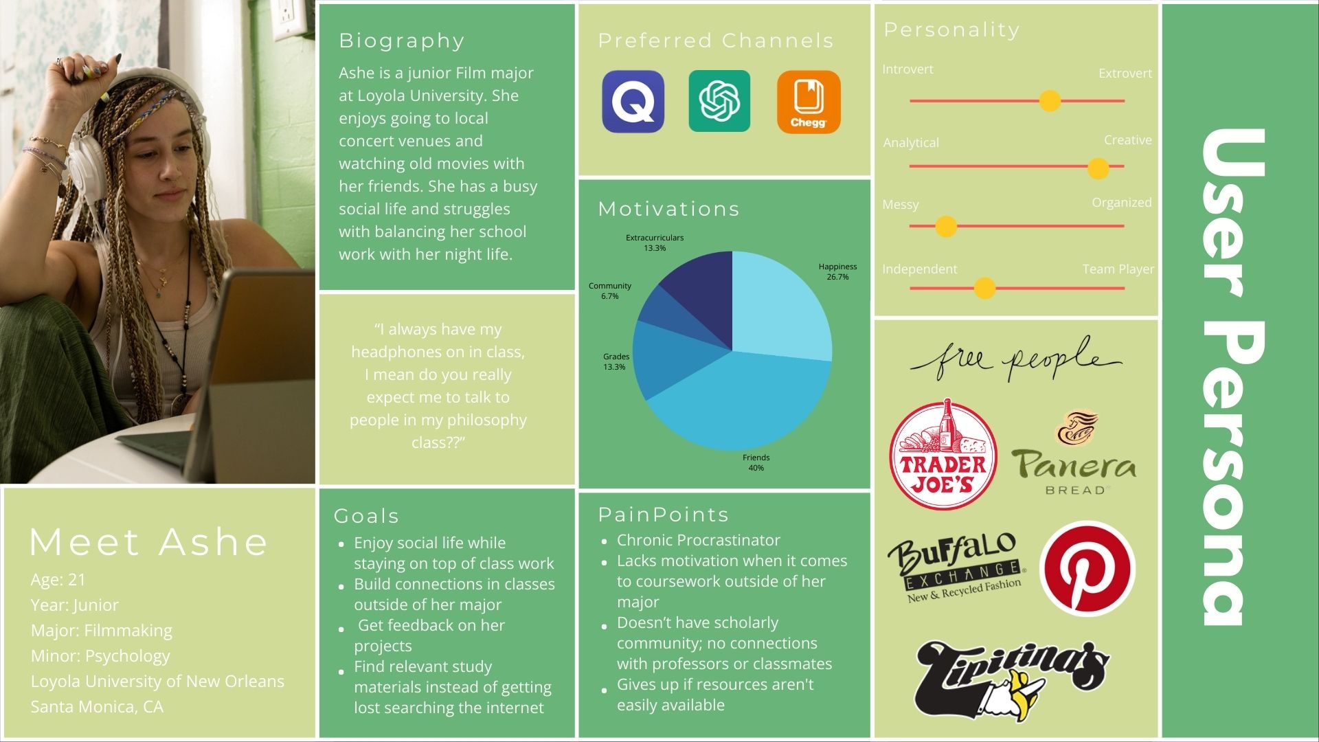
Creating Ashe’s user persona was a pivotal step in shaping the direction and functionality of our coursework support app. Ashe represents a typical student juggling academic responsibilities with an active social life. She’s creative, highly social, and values connection—but also struggles with motivation and organization, especially in classes outside her major.
This persona helped us clearly identify key user needs:
Accessible Resources: Ashe tends to give up when resources aren’t easy to find. This directly influenced our decision to prioritize a centralized location for class materials, so students like her don’t waste time searching.
Peer Support & Community: Ashe’s motivation is heavily tied to her friendships and social network. Including class-specific group chats in the app became essential to help users feel connected, supported, and encouraged.
Instructor Access: Because Ashe feels disconnected from professors, we built in direct messaging to faculty, aiming to close the gap and encourage student-instructor interaction.
Ease of Use: Her tendency to procrastinate and lose focus when overwhelmed meant we needed an intuitive, low-effort interface that reduces friction in navigating tasks.
Creating a Visual Identity
Creating a Visual Identity
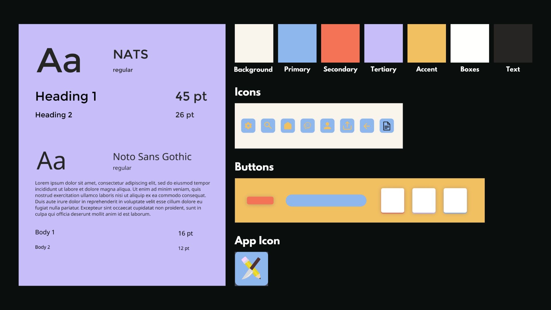
The visual of the app had to match its duel purpose: being a study resource and a source of connection. We chose colors that in combination are reminiscent of early educational resources, and kept them muted. This color palette promotes a calming, focused, and academic atmosphere.
The visual of the app had to match its duel purpose: being a study resource and a source of connection. We chose colors that in combination are reminiscent of early educational resources, and kept them muted. This color palette promotes a calming, focused, and academic atmosphere.

Mapping the Journey
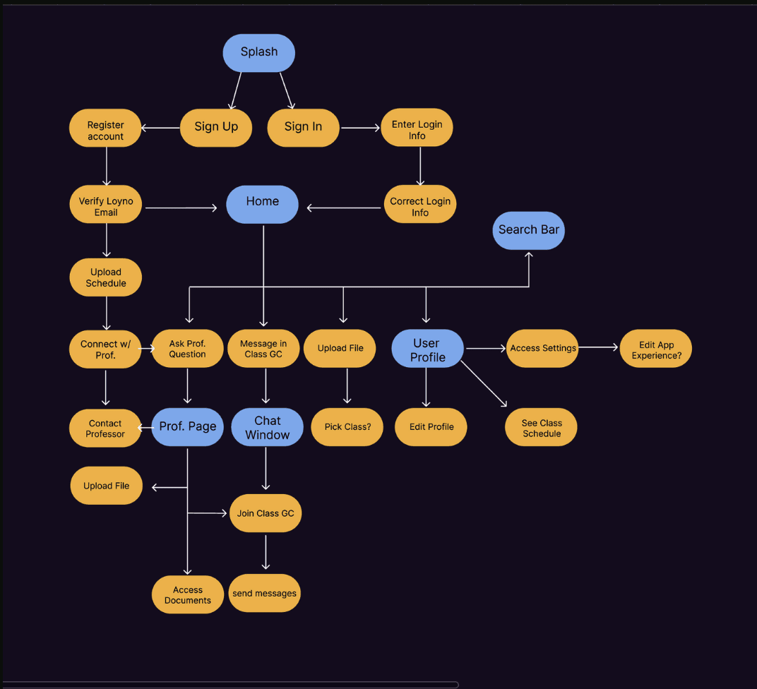
I mapped out the user flow of the app that was the most intuitive for users, keeping things simple with 5 main pages; the Home page, Professor page, Chat forum page, Profile, and a search function. This User flow demonstrates all of the steps the user would have to take to use the features of this app.
I mapped out the user flow of the app that was the most intuitive for users, keeping things simple with 5 main pages; the Home page, Professor page, Chat forum page, Profile, and a search function. This User flow demonstrates all of the steps the user would have to take to use the features of this app.
From Paper to Prototype
From Paper to Prototype
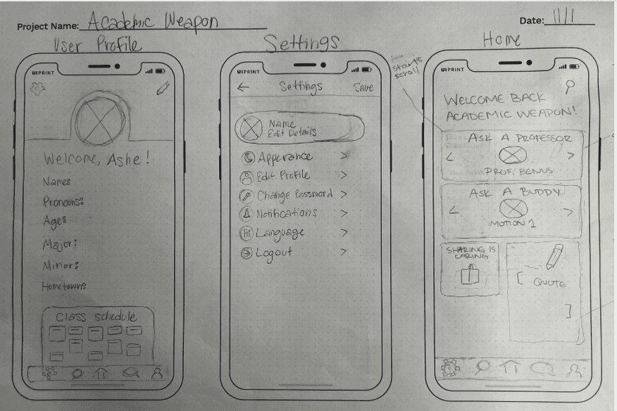
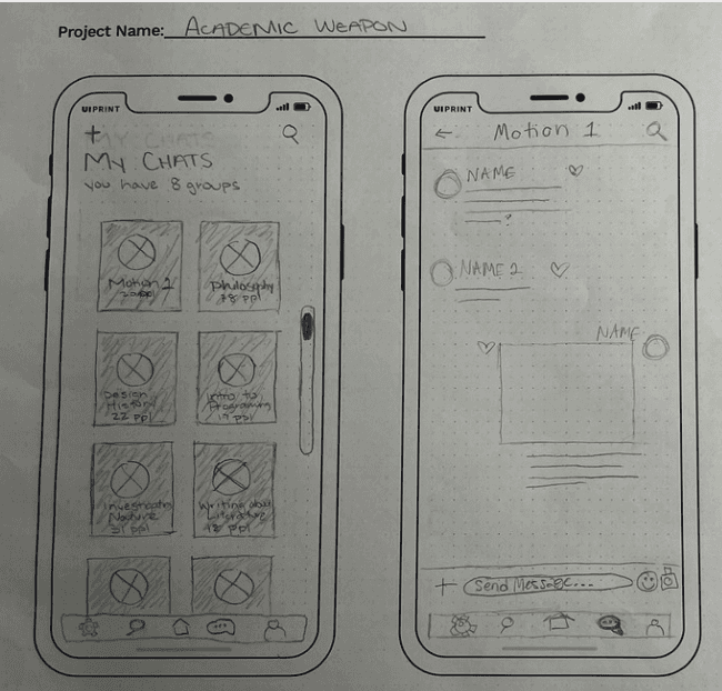
Paper Wireframes:
Paper Wireframes:

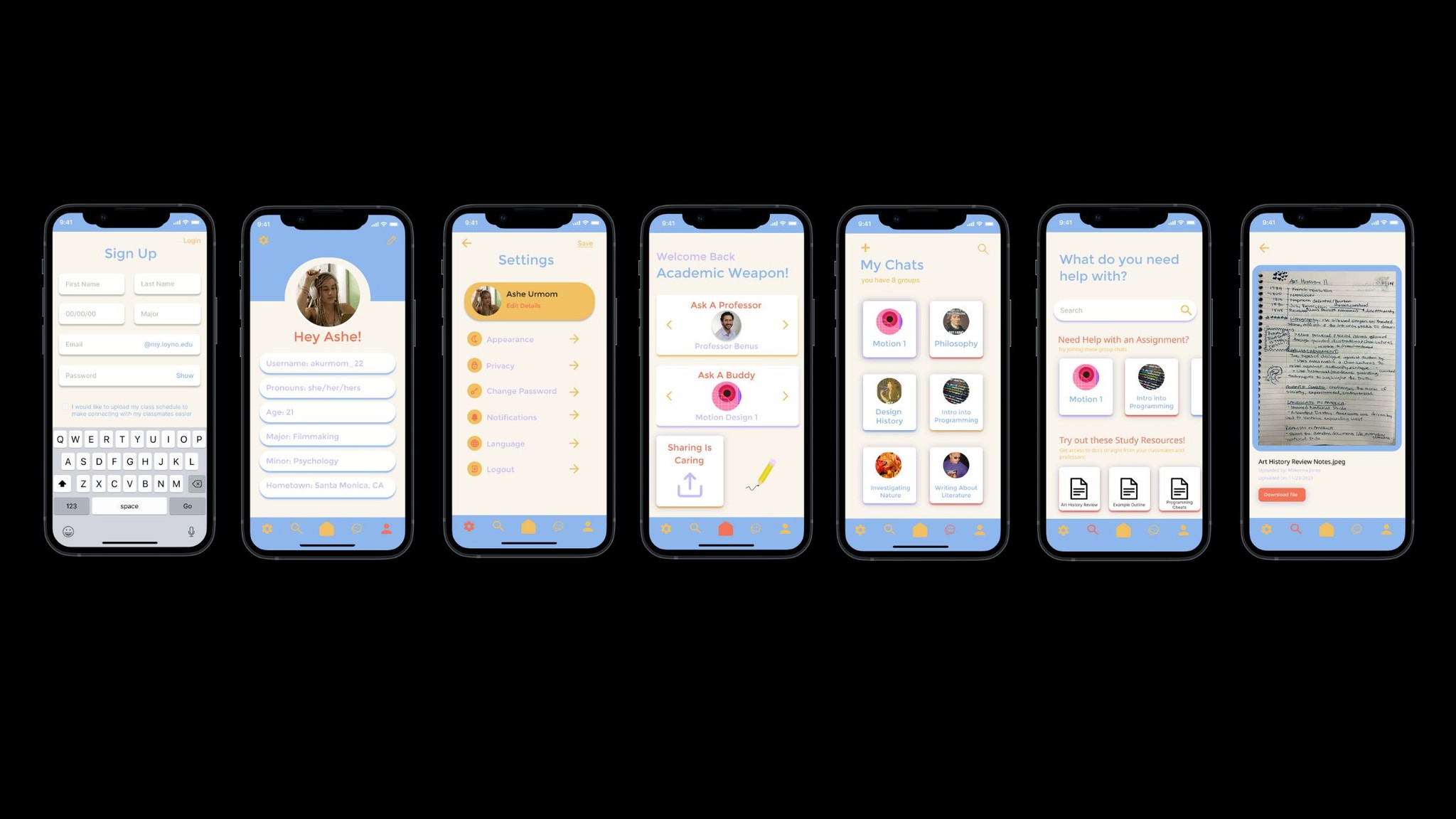
Final Prototype Screens:
Final Prototype Screens:
Reflection
Reflection
Designing this app was a meaningful exploration of how digital tools can foster academic connection, collaboration, and support. From the earliest stages of research, it was clear that students face a range of emotional and logistical barriers when engaging with coursework, especially in classes outside their major. Many users felt isolated, overwhelmed, or unsupported due to limited access to professors, disorganized resources, and a lack of peer interaction.
These insights directly informed our design decisions. By prioritizing features like centralized course pages, class-specific group chats, and direct messaging with professors, we aimed to reduce friction and create a more inclusive academic experience. The style guide ensured visual consistency, while the user flow focused on intuitive navigation to minimize cognitive load and encourage ongoing engagement.
Prototype Link
Prototype Link
Hungry for more? Check out my other work!
Hungry for more? Check out my other work!
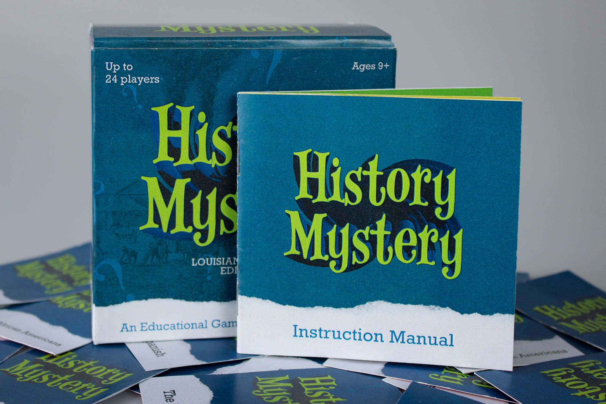
History Mystery
UX/UI Design
Educational game that teaches fourth grade children the history of New Orleans
History Mystery
UX/UI Design
Educational game that teaches fourth grade children the history of New Orleans
History Mystery
UX/UI Design
Educational game that teaches fourth grade children the history of New Orleans

Trader Joe's: A Legacy in Motion
UX/UI Design, Motion Design
A projection mapping experience that visualizes the history of Trader Joe's on store objects.
Trader Joe's: A Legacy in Motion
UX/UI Design, Motion Design
A projection mapping experience that visualizes the history of Trader Joe's on store objects.
Trader Joe's: A Legacy in Motion
UX/UI Design, Motion Design
A projection mapping experience that visualizes the history of Trader Joe's on store objects.

Euphoria Titles
Motion Design
An opening title design for the HBO series Euphoria.
Euphoria Titles
Motion Design
An opening title design for the HBO series Euphoria.
Euphoria Titles
Motion Design
An opening title design for the HBO series Euphoria.